Behind the scenes | Estimated Read time – 4:21
Our team at Race Roster is committed to offering an accessible experience for all. We are currently in the process of auditing the digital accessibility of the Race Roster platform, allowing us to ensure our products and tools will be usable by anyone and everyone.
1. What is digital accessibility?
Digital accessibility is the ability of a website, mobile application, or electronic document to be easily navigated and understood by a wide range of users, including those users who are living with visual, auditory, motor, or cognitive disabilities.
2. How is Race Roster committed to improving the digital accessibility of our platform?
We have prioritized an in-depth audit of digital accessibility on our platform. We have been looking closely at the following:
Color contrast

What is it?
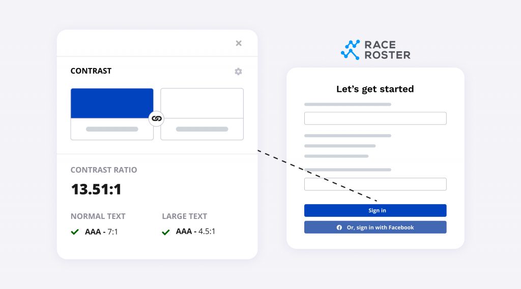
Color contrast refers to how strikingly the color of a foreground object (e.g. text) differs from the color of the background against which it sits.
Why is color contrast important?
People who are able to see may perceive colors in different ways and experience difficulties distinguishing shades and colors (color vision deficiency, or CVD).
Consider these statistics

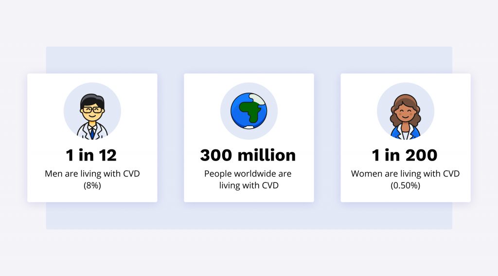
- CVD affects approximately 1 in 12 men (8%) and 1 in 200 women in the world.
- Worldwide, there are approximately 300 million people with CVD.
Source: https://www.colourblindawareness.org/colour-blindness
It is important to consider CVD when designing, however, it is not the only factor. There are other reasons as to why color contrast matters:
- Device screens can vary widely
- Aging can affect light reaching the back of the eye
- Lighting conditions in the area can make it difficult to see the screen
What is Race Roster doing about color contrast?
You may have noticed a shift in our color scheme on the dashboard, website, and marketing content. We have updated the Race Roster brand color scheme to ensure our color contrast meets WCAG Level AAA compliance. This means we are committed to a contrast ratio of at least 7:1 for normal text and 4.5:1 for large text.

We have also ensured that the elements we use are not indicated by color alone. For example, our blue buttons are supported with the words “Continue” as a secondary way for it to be distinguished.
Proper tag semantics and programmatic connection
What is it?
Information inside of a document requires a tag, allowing a computer to properly determine its purpose and role. For example, long blocks of text are marked as paragraphs, clickable boxes are marked as buttons, etc.
Why does it matter?
Sighted users are able to use color, boldness, size, spatial proximity, etc to easily determine the structure and organization of a document, as well as to understand the purpose of buttons and form controls. However, if that information is not accompanied with a proper tag for the computer, it is very difficult and confusing for users using assistive technology.
What is Race Roster doing?
We are auditing all content on our website and platform to ensure we are using the proper tag semantics and programmatic connections.

Document navigation
What is it?
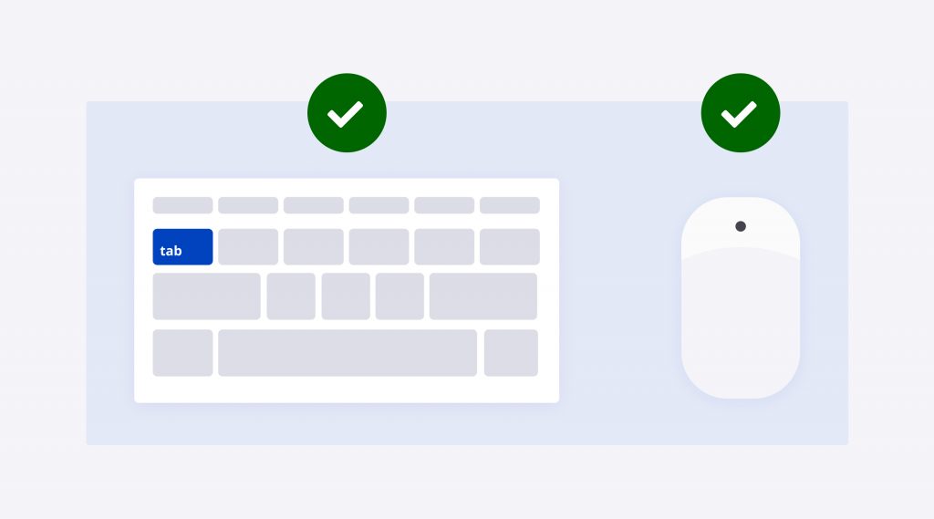
Mouse users are able to easily navigate through a document and its interactive elements by moving their mouse cursor directly to a link they can see and clicking it. However, many people rely on other tools such as keyboards or screen readers to navigate.
Why does it matter?
Users relying on other devices cycle through links, buttons, and form controls in the order that they appear in the code. This may not necessarily match the visual order on the page. It is important to keep the ease of navigation in mind when ordering the elements on a webpage.
What is Race Roster doing?
- For sighted users, we are making sure our designs include a visual indicator of where the focus is present at all times.
- For non-sighted users, we are making sure that the purpose of each interactive element is properly defined, and that any complex functionality is properly and simply described.
- We are checking to make sure that any element with the ability to be interacted with via mouse is also able to be interacted with using a keyboard.
- We are implementing shortcuts to the important parts of the page, and providing the ability to skip over large blocks of interactive elements that may not be relevant.

4. Forms
What is it?
A series of inputs for collecting information.
Why does it matter?
Ensuring proper digital accessibility on forms will make it easier for both sighted and non-sighted users to navigate and understand what information is needed from them.
What is Race Roster doing?
- Ensuring every form element (e.g. text box, checkbox, submit button, etc) is clearly and simply labelled, with any complex behaviour properly and simply described.
- Making required validation obvious to the user before they enter their information.
- Properly marking required fields.
- Providing examples of proper formatting to users (e.g. credit card expiry).
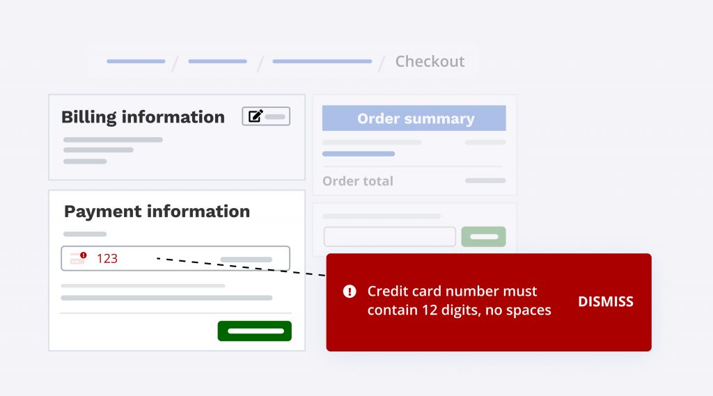
- Making sure that errors triggered by the form submission are simple, descriptive, and properly linked to the incorrect form control. For example, instead of saying “credit card number is wrong”, we would provide a clear explanation on what the input is looking for to be accepted. For example, “credit card number must contain 12 digits, no spaces”.


What’s new at Race Roster?
See all of our releases or visit our what’s new page for the most noteworthy Race Roster updates!