New release | Estimated Read time – 2:26
We recently introduced new enhancements to our fundraising tools, providing you with deeper insight into fundraising metrics, along with sleeker ways to display your organization and fundraising goals.
Let’s dive into what’s new:
1. NEW donation fee coverage chart

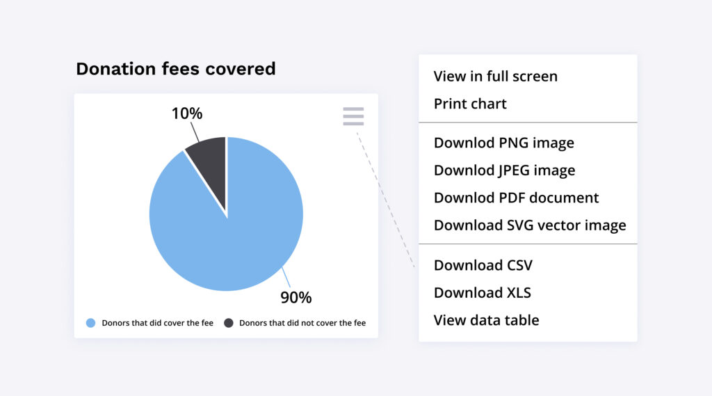
A new chart has been added to your fundraising metrics page, indicating how many donors chose to increase their donation to cover the fee, and how many did not. Before we dive further into this new chart’s capabilities, let’s touch up on the donor top-up tool.
What is the donation fee and how is it covered?
If fundraising is enabled for your event, the “donor top-up tool” is automatically enabled, providing donors with the option to cover the credit card and service fee costs by increasing their donation. Donors are informed that covering the fee will ensure that your fundraising organization receives 100% of the donation amount.

The new donation fee coverage chart allows you to see if the majority of your participants are covering the fee or opting out. On top of an easy-to-check chart, you can also export the data into a number of formats including images, CSV & XLS , PDFs, and data tables, allowing you to use this information however you may need!
2. Updated design of fundraising goals

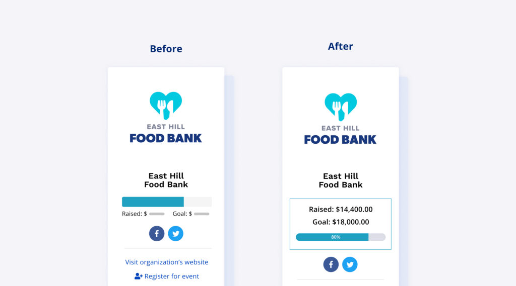
As an event organizer or fundraising organization, you are able to select an overall fundraising goal when setting up your organization on the dashboard. When participants sign up for the event, personal and team fundraising pages are automatically created, allowing fundraisers to set a goal for their team and themselves individually. We have updated the way these goals are displayed alongside the total amount raised!
The new design places more prominence on the goal and amount raised to draw more attention to this area on the page. The text is now laid out clearly so the goal and amount is very easy to spot at-a-glance, increasing the likelihood of someone wanting to help an individual, team, or general organization get closer to achieving their goal!
3. Refreshed look for fundraising organizations displayed on the event details sidebar

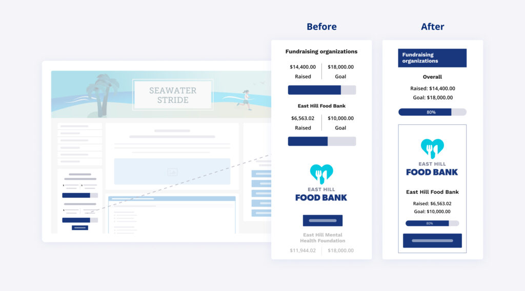
There are a number of ways that fundraising organizations can be displayed on an event details page. Our default design displays the name, logo, goal and goal progress (if applicable), and each organization is accompanied by a “donate now” button. The wording of this button can be customized by you! Alternatively, you can enable a “simple widget”, displaying all fundraising organizations in either a list or dropdown.
We have refreshed the look of our default display, enhancing the look of each organization. The design has been optimized to look great no matter how many organizations you will be displaying. Each organization has been grouped into its own container, creating clear separation between multiple organizations, or adding visual prominence to an organization displayed alone. We’ve also introduced a new header for the fundraising organization section to ensure fundraising information is visible at a glance!

What’s new at Race Roster?
See all of our releases or visit our what’s new page for the most noteworthy Race Roster updates!